Understanding the Role of Pantone Colors in Printing
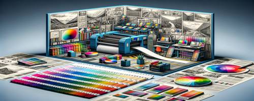
In the world of printing and design, Pantone colors hold a revered position. From offset printing to desktop publishing, these colors play a crucial role in ensuring consistency and accuracy. For those delving into the realms of prepress and paper help, understanding Pantone is indispensable.
The History of Pantone Colors
The story of Pantone begins in the 1960s when Lawrence Herbert purchased a small company that manufactured color cards for cosmetics. By 1963, Herbert had revolutionized the industry by creating the Pantone Matching System (PMS), a standardized color reproduction system. This innovation allowed designers and printers to communicate precise color specifications, eliminating guesswork and reducing discrepancies.
Over the decades, Pantone's influence has grown exponentially. In 2000, they introduced the "Color of the Year," a concept that influences trends across fashion, interior design, and more. By 2021, Pantone had become synonymous with color precision and creativity, cementing its place as an essential tool in design.
The Science Behind Pantone's Color Matching System
At its core, the Pantone Matching System is a language—a language that translates color into numbers. This system comprises over 1,800 unique colors, each identified by a specific code. The science lies in its ability to produce consistent results across different materials and mediums.
Pantone achieves this through meticulous formulation processes. Each color is mixed using precise amounts of base pigments. For instance, to create "Pantone 485 C," specific ratios of red and yellow are used to ensure exact replication every time it's printed. This scientific approach ensures that whether you're printing on glossy paper or matte cardstock, the color remains consistent.
Moreover, Pantone's color guides provide visual references for designers and printers alike. These guides are printed on various substrates to demonstrate how colors appear under different conditions—an invaluable tool for those working in offset printing or desktop publishing.
Pantone Colors in Offset Printing
Offset printing relies heavily on accuracy and consistency—two attributes where Pantone excels. Unlike digital printing that uses CMYK (Cyan, Magenta, Yellow, Black) processes to create colors through dot patterns, offset printing benefits from solid inks like those offered by Pantone.
When using PMS in offset printing:
- Color Consistency: Printers can achieve uniformity across large print runs.
- Specialty Inks: Metallics or fluorescents not possible with CMYK can be easily replicated.
- Reduced Waste: Accurate first-time prints reduce material waste.
Consider a scenario where a brand needs thousands of brochures printed with their signature shade of blue. Using CMYK might lead to slight variations due to dot gain or ink density issues. However, with Pantone inks like "Pantone 286 C," that signature blue will remain true throughout every print run.
The Importance of Consistency in Color Reproduction
Consistency is king when it comes to branding and marketing materials. Imagine walking into a store where every product package looks slightly different because colors weren't consistent during production—it's not just unprofessional; it erodes trust.
With Pantone:
- Brand Integrity: Ensures logos appear identical regardless of location or medium.
- Customer Recognition: Familiarity breeds trust; consistent colors enhance brand recall.
- Quality Assurance: Clients receive what they expect without unpleasant surprises.
This consistency becomes especially critical when dealing with international markets where products might be printed in different countries but must look identical on shelves worldwide.
How Pantone Guides the Design Process
For designers embarking on new projects—be it advertising campaigns or product packaging—Pantone serves as both inspiration and guidepost:
- Inspiration: The annual "Color of the Year" sparks creativity across industries.
- Selection Ease: Designers can quickly select from thousands of shades knowing each will reproduce accurately.
- Collaboration Tool: Facilitates seamless communication between creative teams and production houses globally.
Imagine designing an ad campaign featuring vibrant oranges inspired by "Pantone Living Coral." Knowing this exact hue will appear uniformly across billboards or magazine ads allows designers freedom without compromise.
Pantone Colors and Brand Identity
Brand identity hinges significantly on visual elements—and few aspects are more visual than color! Companies invest heavily into creating recognizable palettes that evoke emotion while conveying their ethos:
- Coca-Cola Red
- Tiffany Blue
- Starbucks Green
These iconic shades aren't just picked at random; they're carefully chosen using systems like PMS for precision reproduction worldwide.
By leveraging these specific hues consistently over time (often trademarked), brands establish themselves firmly within consumer consciousness—a testament to how powerful effective use of Pantones can be!
Challenges and Solutions in Using Pantone Colors in Printing
Despite its advantages there are challenges associated with utilizing PMS effectively:
- Cost Implications: Specialty inks may incur higher costs than standard CMYK processes.
- Limited Range Compared To Digital: While extensive compared traditionally limited compared RGB spectrum used digitally.
- Environmental Concerns: Some specialty pigments might pose environmental risks if not managed responsibly during disposal stages post-printing process completion!
Solutions exist though! By strategically choosing which elements require exact matches versus those suitable for CMYK conversion (e.g., backgrounds), costs can be managed effectively while maintaining desired outcomes environmentally friendly practices such recycling leftover materials further mitigate potential negative impacts associated usage!
Copyright 2006, The Catalog Works, All rights reserved